Pop Magazine Analysis (Double-Page Spread)
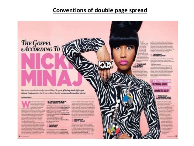

This double-page spread is focused on the artist Nicki Manaj. The house style of this spread is pink and black. the background is a light salmon colour which contrasts with the black used throughout the page, this allows the readers to read the text more clearly. The use of the pink suggests its aimed at a female audience. The artists name has been written in the biggest font on the spread and is the first thing the reader will see when looking at the page. Just as the 'WeLovePop' magazine, this magazine has pointed out where the interview starts by using a different bigger font. Each time there is a new question a bold font has been used to allow the readers know when there is a subject change. there is only one image that has been used for the spread which is located just on the wright side of the page. The image stands out as the artist is wearing a black and white patterned outfit which contrasts with the housestyle this also draws the readers attention. The artist is standing in a fun pose and looking directly at the reader. there isn't too much writing so the reader wont feel overwhelmed and is more likely to read the entire interview. This double-page spread seems more mature and aimed at older readers than the last double-page spread as it focuses on the music side rather than gossip which younger readers usually prefer.
No comments:
Post a Comment