Tuesday 28 March 2017

Pop Magazine Analysis (Double-Page Spread)

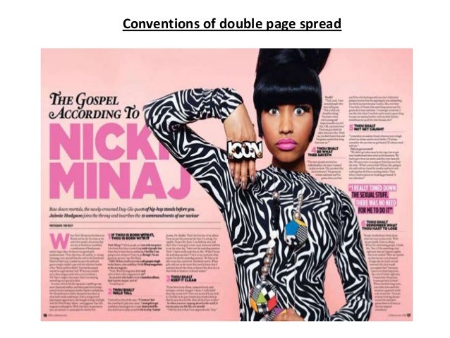
Pop Magazine Analysis 3 (Double-Page Spread)
Features of layout 
The first feature you see is a drop cap, drop caps are used to catch the readers 
attention because th...
 :
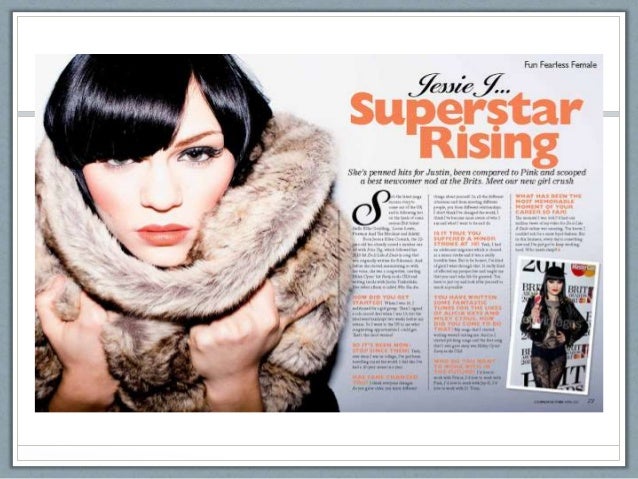
This double-page spread is an interview with the singer Jessie J. The house style is orange and black which rest on a background of white this makes the colours seem brighter and draw the attention of the readers. The bright orange has been used for the main header and at the beginning of each paragraph in the interview this is to show when the questions are asked. The text is on the right side of the spread and take sup around three quarters of the page allowing the reader to not feel overwhelmed with information. The main image takes up the entire left side of the spread and fits in with housestyle as the artist is wearing an orange shade lipstick. At the same time as fitting in with the housestyle, the artists appears to be wearing a brown fluffy jumper which stands out against the white of the spread catching the readers eye. Another smaller image can be seen amongst the writing on the right side of the spread, this image is to do with what is being said in the interview. Just like in the pother two double-page spreads the use of a bold 'S' is used to guide the reader the beginning of the interview. Again the target audience appears to be older females as its actually about the music and not gossip and personal stuff.

Pop Magazine Analysis (Double-Page Spread)

Pop Magazine Analysis (Double-Page Spread)
Conventions of double page spread
4 page magazine spread - Google Search:
This double-page spread is focused on the artist Nicki Manaj. The house style of this spread is pink and black. the background is a light salmon colour which contrasts with the black used throughout the page, this allows the readers to read the text more clearly. The use of the pink suggests its aimed at a female audience. The artists name has been written in the biggest font on the spread and is the first thing the reader will see when looking at the page. Just as the 'WeLovePop' magazine, this magazine has pointed out where the interview starts by using a different bigger font. Each time there is a new question a bold font has been used to allow the readers know when there is a subject change. there is only one image that has been used for the spread which is located just on the wright side of the page. The image stands out as the artist is wearing a black and white patterned outfit which contrasts with the housestyle this also draws the readers attention. The artist is standing in a fun pose and looking directly at the reader. there isn't too much writing so the reader wont feel overwhelmed and is more likely to read the entire interview. This double-page spread seems more mature and aimed at older readers than the last double-page spread as it focuses on the music side rather than gossip which younger readers usually prefer. 

Pop Magazine Analysis (Double-Page Spread)

Pop Magazine Analysis 1 (Double-Page Spread)
This double-page spread is from the popular music magazine 'WeLovePop', which features an interview from the artist Cher Lloyd. The house style of this magazine is pink, black and yellow, the use of bright pink suggests this magazine is for a female audience as the colour is usually associated with girls. The colours are a against a white background which allows the colours to stand out. The main image takes up the right side of the double-page spread whilst the writing is all on the left side. The main image is of the artist who appears to be standing in a playful stance, she is also wearing bright clothing which fit in with house style. The heading is written in a big bold print in pink and black, this takes up half of the left side of the spread which draws the attention of the reader. The sub-heading is in a smaller black font under the main header. The magazine has helped the reader to locate the beginning of the interview by using a big and bold 'W' which has also been highlighted in pink, this highlighting has also been done throughout the interview to draw the readers attention to the more interesting parts. From the simplistic and bright layout it suggests the target audience for this music magazine is for young females. 

Wednesday 22 March 2017

Overall Pop Magazine Contents Page Analysis

After looking at these three examples of pop magazine contents pages I have taken some ideas and have thought about what I will do to make my magazine fit in with this genre. I have decide that my contents page will be bright and colourful yet not too much in the readers face as I want me target audience to be older teens/young adults. As seen in the three examples I will use a range of images, including one bigger image for my main article. I like the way "billboard" magazine has set out the contents page as its simplistic and feel as though its more mature which is what I am aiming for I also like the idea of just having "contents" written at the top but I might have the name of my own music magazine above it as a contribute to my brands identity. I would like to use a similar house style to what my front cover uses and also similar fonts. I also noticed how the magazines old made the page numbers clear I will also so this by having the numbers in a different font and colour to the rest of the writing. I will make the stories mainly about the personal life of the artists and gossip as I would like my audience to be female.

Pop Magazine Analysis (contents)

Pop Magazine Analysis 3 (contents)

Image result for pop magazine contents page billboard
This contents page is from the popular pop magazine "billboard", this contents page is completely different to the previous ones i have looked at as its targets audience is for older people who enjoy this genre, this can be seen throughout the house style has it has used black, grey and blue. although the blue and black stand out to the readers its not too much in the readers face. the page design is simplistic as it is set out in a box style this again suggests its for older readers. the title "contents" can clearly be seen at the top of the page in a bold black font. the main image is of a female artist who appears in a serious stance, this again suggest its more about the music and not so much gossip. Just under the title three smaller images can be seen, the brightness of the images contrasts with the grey and white back grand as the images stand out more this is eye catching to the reader. 

Pop Magazine Analysis (contents)

Pop Magazine Analysis 2 (contents)

For the this pop magazines contents page pink, white and yellow has been used for the housestyle, the use of the colour pink suggests the target audience are young female as this colour is usually seen as feminine. The bright yellow which goes along with the pink give this magazine a summer vibe, furthermore the bright colours implies the magazine is for a young audience as it comes across fun and playful. The background to the contents page is white which allows the colours to stand out even more. no where on the page is the word "contents" used, instead "inside this mag..." is written at the top this contributes to a sense of brand i identity as it is done in all "Top Of The Pops" magazine. this same branding technique can also be seen in the other pop  magazine I looked at (WeLovePop). The contents title is big and has been written in a hand-written style which is fun, this again suggests the magazine if aimed at younger readers. Another thing which this contents page does, which is seen in all "Top Of The Pops" magazines, is have an actual image of the front cover of this magazines issue, there are arrows pointing out different stories which allow the reader to find the stories they wanna read easily. The page numbers are in a big bold pink font allowing the reader to see them better. Other images have been used, these smaller images draw the readers attention to them and convince the reader to look at those stories first. The contents has been split up into three different sections each with a different subtitle, they focus on celebs, gossip and shopping, these stories tend to interest younger readers as they are more interested in the gossip than they are with the actual music. Altogether the contents page is simplistic, fun and eye catching.