Monday, 13 February 2017

Pop Magazine Analysis (contents)

Pop Magazine Analysis 1 (contents)

Image
A pink, blue and black colour scheme has been used for the contents page, the use of the pink suggests the magazines target audience are girls and the use of the bright tones make it seem fun and inviting which will be appealing to younger readers.All the colours stand out against the white background which makes it easier to read. Instead of contents page been written at the top of the page it says We Love This... which contributes to a sense of brand identity as it is done in all WeLovePop magazines. the font of the title is in a  big bold fun font which again suggests the magazine target audience is young. The WeLovePop logo can also be seen in the top corner of the magazine. there are not any blank spaces on the page as its covered in images, on the page there is a range of image sizes which is showing the reader what the most exiting stories in the magazine are. small quotations of the stories are put with the picture this is to again allow the reader to see what stories are the most interesting. There is a small amount of text which is from the magazine editor to the reader which again is used in all WeLovePop magazines. under the editors letter there is a small box which shows all the page numbers and what is written on each page. The fun but simplistic layout of the page allows the reader to find the stories they want easily. 

Overall Pop Magazine Cover Analysis

From looking at the three pop music magazine cover examples I have an idea of how i would like my finished cover to look. I have decided that my target audience will be older females (16-onward), i have chosen this as I liked the way Billboard Magazine looked and would like my music magazine to have a similar feel. I will still use bright colours for my cover just as I had seen on the WeLovePop and Top Of The Pops cover page but i do not think I will be using girly bubbly writing as I would like it to have a more mature feel for the readers. I have not yet decided if I would like any smaller images on the page or if I will just stick to one main image. I have also decided that my magazine will be more about the personal life of the artists rather than just the music this is because I feel as though females would be more interested in the gossip. In my opinion I feel as though the way WeLovePop is set out is messy and has a lot going on which is not what I would like for my magazine and will avoid. I have not yet thought of a name for the magazine but I would like it to be short/one word.

Pop Magazine Analysis

        Pop Magazine Analysis 3

       
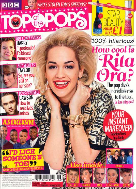
MastHead: The masthead is written in a girly bubbly font which suggests this magazines target audience is young girls. The masthead is also written in white inside a bright pink text box which stands out against the white background, making it eye catching for readers The masthead is used for all of the Top Of The Pops magazines his allows the frequent readers to easily pick out the magazine in a shop. 
House Style: the house style is pink, white, black and yellow. The colours pink and yellow suggest warmth and summer vibes. By using a lot of ink it implies the target audience are young girls. as well as the masthead,the rest of the writing on the page is in a fun and bubbly font which again suggests the target audience is female. 
Main Image: The main image is of pop singer Rita Ora which suggests the magazine is aimed at a pop music genre, the image is big and in the middle of the page this allows the readers to see straight away who the main story of the magazine is. Rita Ora is looking at the camera creating the idea she is looking directly at the readers. She is smiling and in a playful stance which gives the impression she is a warm and friendly person and the story is going to be happy.
Smaller Images: all the smaller images are of pop singers and young celebrities which suggest the the magazine is aimed at a younger target audience. There are a lot of smaller images on the page which again suggests the magazine is for younger readers as they enjoy looking at pictures. 
Coverlines: the majority of the coverlins are in pink and black which follows the house style and also suggests the target audience for the magazine is young females. the coverlines are all about boys, fashion and gossip which is what young girls will find interesting. 
MainCoverine: The maincoverline is written in a pink bubbly font this stands out on page and makes it eye catching to the reader. The pink used suggests the magazine is for girls. 


Pop Magazine Analysis

Pop Magazine Analysis 2

Justin-Bieber-We-Love-Pop-Magazine 
MastHead: The masthead is the WeLovePop logo, this is seen on every edition of the magazine which makes it recognisable to the readers. The logo is written in a fun font inside a speech bubble this suggests its content is not just about the music but the gossip surrounding the artists.
HouseStyle: The house style of this magazine is pink, blue and white. By using a lot of pink on the front cover it automatically suggests the target audience for this magazine is young girls as it is a colour which is stereotypically associated with girls. unlike the majority of music magazines the background is white this means the reader will focus more on the images as they stand out. the font used throughout the cover is big and bubbly which implies it is for a female audience.
Main Coverline: The main cover line is the only pink text on the front cover which highlights the importance of the story, the font used for the main coverline is also written in a different font than the other coverlines this allows the reader to know what the main story of this issue will be.
Main Image: The main image is of pop singer Justin Bieber which shows the magazine is for pop music lovers. Justin is smiling at the camera which creates the idea he is looking at the reader directly he is also in a confident stance. The image is large and has been placed in the centre of the page, this could be to create the focus point for the readers.
CoverLines: The cover lines are mainly blue and black which follows the house style for the page the coverlins are mainly about fashion and boys which suggests its for a female audience.
Smaller Images: All the smaller images are of younger celebrities and fit in the pop music genre. there are lots of smaller images which suggests its for a younger audience as they attracted to more visual images which keeps them entertained.

Tuesday, 7 February 2017

Pop magazine analysis

Pop Magazine Analysis 1

Katy-Perry-Billboard-Magazine-1

MastHead: The masthead has been written in a big bold black font which is easy to read, this same masthead is used for all of Billboards magazine covers which makes it recognisable to its frequent readers. The "a" and the "d" have been coloured in blue and yellow which implies its more fun and inviting for the readers this suggests its target audience could range from teens to young adults.
Main Image: The main image is of Pop singer Katy Perry, she takes up the majority of the page with a mid-shot. The image is in front of the masthead  which is unusual this shows her importance to this issue of the magazine. In this image she is wearing a short flowery dress as well as having real flowers wrapped around her body and hair, the bright colours of the flowers stand out against her dark hair and light skin complexion. She is looking towards the camera making it seem as though she is directly staring at the reader almost saying "Im interesting, read me". 
House Style: The house style is pink, yellow and black. The colours pink and yellow have connotations of summer and warmth which are welcoming towards the reader. The pink used for the entire cover is light which doesn't drown out the image of Katy Perry, also the black font rests nicely on this shade. 
Main Coverline: The main coverline is only a few font sizes smaller than the masthead this suggests its importance to this issue of the magazine. The Main coverline is just the name of the artist this allows the reader to know what the main subject will be inside the magazine.
Coverlines: The coverlines are mainly yellow and black which stand out against the pink background and makes it easy for the readers.  

Friday, 3 February 2017

Preliminary Task

The first task was to complete a school magazine front cover and contents page.
This task was to allow me to get experience using Photoshop and InDesign, both these programs will help me complete my music magazine.Photoshop allowed me to clean up my pictures and cut out any unwanted parts, whilst InDesign allowed me to create the blueprint of the school magazine. During this task I took a wide range of photos; I  had the opportunity to work on my photography skills and I have become more confident with using the camera. These new found skills will help me when deciding how and what I would like my photos like for the magazine and what lay out I would like.