Tuesday, 2 May 2017

final cut


Overall update

I have decided to keep the same house style I used for my rough cut, the purple-pink fits in with my genre and makes it easier for readers to know who the target audience is.

Contents page Layout Update

Looking at my research into pop music magazines I have noticed in the contents pages they don't just have one long list of number pages but has different sections on the page such as "Reviews for albums" and "Exclusive stories".  I will change this about my contents page so all the writing is broken up.

Rough cut feedback

After I handed in my rough cut for my music magazine i received feedback from my teacher informing me on what i need to improve for when i publish my final music magazine. 
I'm going to stick with my house style for the magazine as it fits in with my genre.
I have decided to take new pictures and/or edit them further as they appear dark and blurry.

Rough cut


Double page-spread update

For my double page-spread article I used two different fonts; a bolder bigger font was used for when a question was being asked and a smaller thinner font was used for when a question is being answered this is to make it easier to read.

Monday, 1 May 2017

Front cover Update

I have also noticed that in music magazines they have give away and competition readers can enter, this is usually advertised on the front of the cover to draw in more attention from readers. I have decided to also do this by adding a small ticket giveaway on the front cover.

The Masthead

Looking at "Billboard" magazine I noticed they have a branding technique where they colour the inside of two of the letters to fit in with the house style of the each of their issues. I have decided to do a similar thing by adding colour to the two "o" in "CONTROL".

Front Cover Update

I have used the same font I am using for my masthead as I have for the sub-stories around the front cover but I have used a different colour so the masthead stands out further and catches the readers attention

Pop Magazine Name

I have decided my music magazine will be called "CONTROL"

Double Page-Spread final design


From the designs I drew out on paper a felt this one also followed most the codes and conventions of a pop music magazine double-page spread.

Double PAge-Spread layout designs

Some designs I drew out paper for my layout.
 

Front cover final layout design


From some of the designs I drew out, I decided this one followed a lot of the codes and conventions of a pop music magazine front cover.


Front Cover Layout Ideas

Some design ideas I drew out on paper for my layout.
 

Friday, 28 April 2017

Magazine Name

I've been thinking about what I might possibly be naming my magazine and have chosen two I might go for.
+Glitch
+Control

Pop Magazine Name Idea

Looking back at the pop magazines I analysed I have noticed that two of the examples have the word "Pop" in the title (WeLovePop and TopOfThePops), but both are aimed at a younger audience. Since my target audience is older teens to young adults i have decided to look at what other music magazines have in common with the title. I discovered that a lot of music magazines use one word as the title such as Mojo and billboard, although Mojo isn't exactly a pop magazine its aimed at an older audience. For my magazine I am thinking of having a one worded title.

Front Cover Update

I have decide that since my music magazine is for an older audience I will not be using an extremely girly font for title but instead use a more sophisticated style. The magazine title will be white but I have thought about having one or two of the letters in a different colour as the other music magazine do a similar thing to their magazine name as a branding technique.

Front Cover Photoshoped Picture

After multiple attempts I have decided on this image to feature on my music magazine front cover.

I picked this image because when i was looking back at the music magazines I had analysed I noticed the main image on the page would be a person looking directly at the camera and they were mainly mid-shots.

I decided to brighten up the image and cut out the background.


Double Page-Spread Update 2

I changed the colour of the background as the image i have chosen for the double page-spread is taken against a plain background ( the image was taken against a white-cream wall and i have decided to keep it as it fits in with the new style I am going for) I changed the house style and have decided to base it around the person in the image and what they are wearing., which is black and red.  I thought about what colour I will write the article in (most likely black) and what colour I  will use for the double page spread title. The image will take up the entire double page spread and the writing will be around it.
Image result for black    Image result for blood red 

Contents Page Update 2

Again I decide to start over with the layout of my contents page I felt as though the original design was a little childish. I have decide to stay with the same house style as it also fits in with the front cover. I have looked at other "billboard" contents pages as I like the layout and feel as though it will fit in with my target audience.

Front Cover Update 2

I changed the entire design for my front cover, keeping with a similar layout but changing the house style and fonts. I have decided to have a pink-purple colour for the background this will make it more obvious to readers who the target audience is.  I have also chosen to have the title in a bold whit font. I made all these changes as I felt as though it was pretty dull and looked nothing like any of the magazines I analysed. I have also added two new colours to the house style, dark purple and a bright blue. As well as the magazine title being white i have also decided to to have the sub-stories on the front cover written in white.
Image result for purple   Image result for dark turquoise   Image result for black

Double-Page Spread Pictures


 I made sure my photos followed the codes and conventions of double page spread.
+ person looking at camera.
+ Image should take up at least half the double page spread.
+ Image needs to be bright and eye catching for the reader. 

Contents Page Pictures


I am going to use a range of images for the contents page, looking back at the music magazines I analysed I noticed they have four or more images.

Front Cover Pictures


When taking pictures i thought about what the other pop magazines did for there front cover images
+ The person should be looking at the camera
+ The image should take up the majority of the page as it is one of the most important factors
+ The image should fit in with the front cover house style

Double Page-Spread HouseStyle 1

Looking back at the double-page spreads from other music magazines I have noticed they use either white or light colours as the background, this is done to allow all the readers focus be on the image and story. I have decided to use a light purple shade for the background as it will fit in with my overall music magazine colour scheme. I have gone for the black bold writing and a darker purple shade for the title of the double page-spread. the use of the purple continues to show who the target audience is for the magazine.


Image result for purple     Image result for light purple     Image result for black

Contents Page HouseStyle 1

For the contents page I have decided to use a pastel purple for the background as it stays within the same house style as the front cover and any text or images used will again stand out and catch the readers eyes. I have also decide to use black blocks to place white writing in as I have seen this in the music magazine contents pages I analysed. I will use black for the numbers as its important for readers to know which stories at where.       


Image result for black     Image result for purple    Image result for white

Front Cover HouseStyle 1

From looking at some examples of music magazine front covers I have decided to use a light peachy tone as the background colour, this is because the other magazines have used light colours so that the writing and Images can stand out against it. As it is aimed at older female readers I have not gone for the cliché pink but made sure that by using this colour its still obvious who the target reader is. For the text of the front cover I have decided to use purple, white and black as all will be easy to read and eye-catching at the same time. The purple will be used specifically for the magazine title and the main story as its a more bold colour and will allow the reader to see what is the most important thing on the page. The black and white will be used for the sub-stories.


Image result for light orange    Image result for purple    Image result for black

Pop Magazine Update 1

Thinking about it I have decided to change a few ideas I had. Instead of having the magazine focused mostly on the artists personal life and gossip I have decided that the magazine will actually be about the music. I have made this change as I thought my magazine started to become more like a gossip magazine than a pop music magazine.

Sunday, 23 April 2017

Overall Pop Magazine Double-Page Spread Analysis

From Looking at the three pop magazine double page spreads I have decided that I will use a light colour for the background as this will allow the images I take to stand out and also the text. I will also have the image take up at least half of the page and the image will most likely be a mid-shot. I need to include an important or interesting quotation from the article to use as a title, this needs to be written in a big bold font to catch the readers eye and make them want to read the entire article.

Tuesday, 28 March 2017

Pop Magazine Analysis (Double-Page Spread)

Pop Magazine Analysis 3 (Double-Page Spread)
Features of layout 
The first feature you see is a drop cap, drop caps are used to catch the readers 
attention because th...
 :
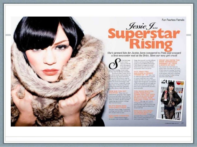
This double-page spread is an interview with the singer Jessie J. The house style is orange and black which rest on a background of white this makes the colours seem brighter and draw the attention of the readers. The bright orange has been used for the main header and at the beginning of each paragraph in the interview this is to show when the questions are asked. The text is on the right side of the spread and take sup around three quarters of the page allowing the reader to not feel overwhelmed with information. The main image takes up the entire left side of the spread and fits in with housestyle as the artist is wearing an orange shade lipstick. At the same time as fitting in with the housestyle, the artists appears to be wearing a brown fluffy jumper which stands out against the white of the spread catching the readers eye. Another smaller image can be seen amongst the writing on the right side of the spread, this image is to do with what is being said in the interview. Just like in the pother two double-page spreads the use of a bold 'S' is used to guide the reader the beginning of the interview. Again the target audience appears to be older females as its actually about the music and not gossip and personal stuff.

Pop Magazine Analysis (Double-Page Spread)

Pop Magazine Analysis (Double-Page Spread)
Conventions of double page spread
4 page magazine spread - Google Search:
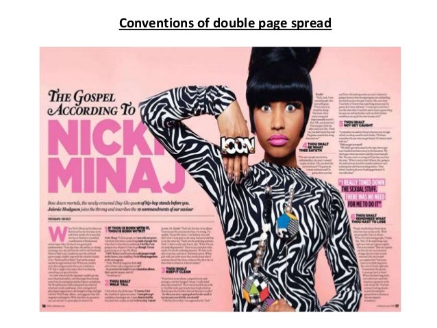
This double-page spread is focused on the artist Nicki Manaj. The house style of this spread is pink and black. the background is a light salmon colour which contrasts with the black used throughout the page, this allows the readers to read the text more clearly. The use of the pink suggests its aimed at a female audience. The artists name has been written in the biggest font on the spread and is the first thing the reader will see when looking at the page. Just as the 'WeLovePop' magazine, this magazine has pointed out where the interview starts by using a different bigger font. Each time there is a new question a bold font has been used to allow the readers know when there is a subject change. there is only one image that has been used for the spread which is located just on the wright side of the page. The image stands out as the artist is wearing a black and white patterned outfit which contrasts with the housestyle this also draws the readers attention. The artist is standing in a fun pose and looking directly at the reader. there isn't too much writing so the reader wont feel overwhelmed and is more likely to read the entire interview. This double-page spread seems more mature and aimed at older readers than the last double-page spread as it focuses on the music side rather than gossip which younger readers usually prefer. 

Pop Magazine Analysis (Double-Page Spread)

Pop Magazine Analysis 1 (Double-Page Spread)
This double-page spread is from the popular music magazine 'WeLovePop', which features an interview from the artist Cher Lloyd. The house style of this magazine is pink, black and yellow, the use of bright pink suggests this magazine is for a female audience as the colour is usually associated with girls. The colours are a against a white background which allows the colours to stand out. The main image takes up the right side of the double-page spread whilst the writing is all on the left side. The main image is of the artist who appears to be standing in a playful stance, she is also wearing bright clothing which fit in with house style. The heading is written in a big bold print in pink and black, this takes up half of the left side of the spread which draws the attention of the reader. The sub-heading is in a smaller black font under the main header. The magazine has helped the reader to locate the beginning of the interview by using a big and bold 'W' which has also been highlighted in pink, this highlighting has also been done throughout the interview to draw the readers attention to the more interesting parts. From the simplistic and bright layout it suggests the target audience for this music magazine is for young females. 

Wednesday, 22 March 2017

Overall Pop Magazine Contents Page Analysis

After looking at these three examples of pop magazine contents pages I have taken some ideas and have thought about what I will do to make my magazine fit in with this genre. I have decide that my contents page will be bright and colourful yet not too much in the readers face as I want me target audience to be older teens/young adults. As seen in the three examples I will use a range of images, including one bigger image for my main article. I like the way "billboard" magazine has set out the contents page as its simplistic and feel as though its more mature which is what I am aiming for I also like the idea of just having "contents" written at the top but I might have the name of my own music magazine above it as a contribute to my brands identity. I would like to use a similar house style to what my front cover uses and also similar fonts. I also noticed how the magazines old made the page numbers clear I will also so this by having the numbers in a different font and colour to the rest of the writing. I will make the stories mainly about the personal life of the artists and gossip as I would like my audience to be female.

Pop Magazine Analysis (contents)

Pop Magazine Analysis 3 (contents)

Image result for pop magazine contents page billboard
This contents page is from the popular pop magazine "billboard", this contents page is completely different to the previous ones i have looked at as its targets audience is for older people who enjoy this genre, this can be seen throughout the house style has it has used black, grey and blue. although the blue and black stand out to the readers its not too much in the readers face. the page design is simplistic as it is set out in a box style this again suggests its for older readers. the title "contents" can clearly be seen at the top of the page in a bold black font. the main image is of a female artist who appears in a serious stance, this again suggest its more about the music and not so much gossip. Just under the title three smaller images can be seen, the brightness of the images contrasts with the grey and white back grand as the images stand out more this is eye catching to the reader. 

Pop Magazine Analysis (contents)

Pop Magazine Analysis 2 (contents)

For the this pop magazines contents page pink, white and yellow has been used for the housestyle, the use of the colour pink suggests the target audience are young female as this colour is usually seen as feminine. The bright yellow which goes along with the pink give this magazine a summer vibe, furthermore the bright colours implies the magazine is for a young audience as it comes across fun and playful. The background to the contents page is white which allows the colours to stand out even more. no where on the page is the word "contents" used, instead "inside this mag..." is written at the top this contributes to a sense of brand i identity as it is done in all "Top Of The Pops" magazine. this same branding technique can also be seen in the other pop  magazine I looked at (WeLovePop). The contents title is big and has been written in a hand-written style which is fun, this again suggests the magazine if aimed at younger readers. Another thing which this contents page does, which is seen in all "Top Of The Pops" magazines, is have an actual image of the front cover of this magazines issue, there are arrows pointing out different stories which allow the reader to find the stories they wanna read easily. The page numbers are in a big bold pink font allowing the reader to see them better. Other images have been used, these smaller images draw the readers attention to them and convince the reader to look at those stories first. The contents has been split up into three different sections each with a different subtitle, they focus on celebs, gossip and shopping, these stories tend to interest younger readers as they are more interested in the gossip than they are with the actual music. Altogether the contents page is simplistic, fun and eye catching. 

Monday, 13 February 2017

Pop Magazine Analysis (contents)

Pop Magazine Analysis 1 (contents)

Image
A pink, blue and black colour scheme has been used for the contents page, the use of the pink suggests the magazines target audience are girls and the use of the bright tones make it seem fun and inviting which will be appealing to younger readers.All the colours stand out against the white background which makes it easier to read. Instead of contents page been written at the top of the page it says We Love This... which contributes to a sense of brand identity as it is done in all WeLovePop magazines. the font of the title is in a  big bold fun font which again suggests the magazine target audience is young. The WeLovePop logo can also be seen in the top corner of the magazine. there are not any blank spaces on the page as its covered in images, on the page there is a range of image sizes which is showing the reader what the most exiting stories in the magazine are. small quotations of the stories are put with the picture this is to again allow the reader to see what stories are the most interesting. There is a small amount of text which is from the magazine editor to the reader which again is used in all WeLovePop magazines. under the editors letter there is a small box which shows all the page numbers and what is written on each page. The fun but simplistic layout of the page allows the reader to find the stories they want easily. 


Overall Pop Magazine Cover Analysis

From looking at the three pop music magazine cover examples I have an idea of how i would like my finished cover to look. I have decided that my target audience will be older females (16-onward), i have chosen this as I liked the way Billboard Magazine looked and would like my music magazine to have a similar feel. I will still use bright colours for my cover just as I had seen on the WeLovePop and Top Of The Pops cover page but i do not think I will be using girly bubbly writing as I would like it to have a more mature feel for the readers. I have not yet decided if I would like any smaller images on the page or if I will just stick to one main image. I have also decided that my magazine will be more about the personal life of the artists rather than just the music this is because I feel as though females would be more interested in the gossip. In my opinion I feel as though the way WeLovePop is set out is messy and has a lot going on which is not what I would like for my magazine and will avoid. I have not yet thought of a name for the magazine but I would like it to be short/one word.

Pop Magazine Analysis

        Pop Magazine Analysis 3

       
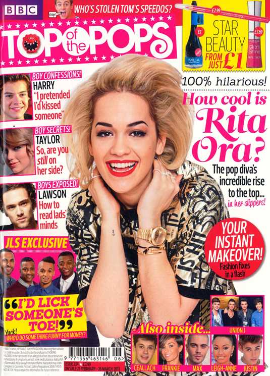
MastHead: The masthead is written in a girly bubbly font which suggests this magazines target audience is young girls. The masthead is also written in white inside a bright pink text box which stands out against the white background, making it eye catching for readers The masthead is used for all of the Top Of The Pops magazines his allows the frequent readers to easily pick out the magazine in a shop. 
House Style: the house style is pink, white, black and yellow. The colours pink and yellow suggest warmth and summer vibes. By using a lot of ink it implies the target audience are young girls. as well as the masthead,the rest of the writing on the page is in a fun and bubbly font which again suggests the target audience is female. 
Main Image: The main image is of pop singer Rita Ora which suggests the magazine is aimed at a pop music genre, the image is big and in the middle of the page this allows the readers to see straight away who the main story of the magazine is. Rita Ora is looking at the camera creating the idea she is looking directly at the readers. She is smiling and in a playful stance which gives the impression she is a warm and friendly person and the story is going to be happy.
Smaller Images: all the smaller images are of pop singers and young celebrities which suggest the the magazine is aimed at a younger target audience. There are a lot of smaller images on the page which again suggests the magazine is for younger readers as they enjoy looking at pictures. 
Coverlines: the majority of the coverlins are in pink and black which follows the house style and also suggests the target audience for the magazine is young females. the coverlines are all about boys, fashion and gossip which is what young girls will find interesting. 
MainCoverine: The maincoverline is written in a pink bubbly font this stands out on page and makes it eye catching to the reader. The pink used suggests the magazine is for girls. 


Pop Magazine Analysis

Pop Magazine Analysis 2

Justin-Bieber-We-Love-Pop-Magazine 
MastHead: The masthead is the WeLovePop logo, this is seen on every edition of the magazine which makes it recognisable to the readers. The logo is written in a fun font inside a speech bubble this suggests its content is not just about the music but the gossip surrounding the artists.
HouseStyle: The house style of this magazine is pink, blue and white. By using a lot of pink on the front cover it automatically suggests the target audience for this magazine is young girls as it is a colour which is stereotypically associated with girls. unlike the majority of music magazines the background is white this means the reader will focus more on the images as they stand out. the font used throughout the cover is big and bubbly which implies it is for a female audience.
Main Coverline: The main cover line is the only pink text on the front cover which highlights the importance of the story, the font used for the main coverline is also written in a different font than the other coverlines this allows the reader to know what the main story of this issue will be.
Main Image: The main image is of pop singer Justin Bieber which shows the magazine is for pop music lovers. Justin is smiling at the camera which creates the idea he is looking at the reader directly he is also in a confident stance. The image is large and has been placed in the centre of the page, this could be to create the focus point for the readers.
CoverLines: The cover lines are mainly blue and black which follows the house style for the page the coverlins are mainly about fashion and boys which suggests its for a female audience.
Smaller Images: All the smaller images are of younger celebrities and fit in the pop music genre. there are lots of smaller images which suggests its for a younger audience as they attracted to more visual images which keeps them entertained.

Tuesday, 7 February 2017

Pop magazine analysis

Pop Magazine Analysis 1

Katy-Perry-Billboard-Magazine-1

MastHead: The masthead has been written in a big bold black font which is easy to read, this same masthead is used for all of Billboards magazine covers which makes it recognisable to its frequent readers. The "a" and the "d" have been coloured in blue and yellow which implies its more fun and inviting for the readers this suggests its target audience could range from teens to young adults.
Main Image: The main image is of Pop singer Katy Perry, she takes up the majority of the page with a mid-shot. The image is in front of the masthead  which is unusual this shows her importance to this issue of the magazine. In this image she is wearing a short flowery dress as well as having real flowers wrapped around her body and hair, the bright colours of the flowers stand out against her dark hair and light skin complexion. She is looking towards the camera making it seem as though she is directly staring at the reader almost saying "Im interesting, read me". 
House Style: The house style is pink, yellow and black. The colours pink and yellow have connotations of summer and warmth which are welcoming towards the reader. The pink used for the entire cover is light which doesn't drown out the image of Katy Perry, also the black font rests nicely on this shade. 
Main Coverline: The main coverline is only a few font sizes smaller than the masthead this suggests its importance to this issue of the magazine. The Main coverline is just the name of the artist this allows the reader to know what the main subject will be inside the magazine.
Coverlines: The coverlines are mainly yellow and black which stand out against the pink background and makes it easy for the readers.  

Friday, 3 February 2017

Preliminary Task

The first task was to complete a school magazine front cover and contents page.
This task was to allow me to get experience using Photoshop and InDesign, both these programs will help me complete my music magazine.Photoshop allowed me to clean up my pictures and cut out any unwanted parts, whilst InDesign allowed me to create the blueprint of the school magazine. During this task I took a wide range of photos; I  had the opportunity to work on my photography skills and I have become more confident with using the camera. These new found skills will help me when deciding how and what I would like my photos like for the magazine and what lay out I would like.